The average Netflix user spends about 10 minutes just scrolling before choosing something to watch—a digital version of menu paralysis. With its latest interface overhaul, Netflix aims to cut through that indecision and get viewers into content faster. For Samsung TV owners now enjoying HDR10+ support, that means less time browsing and more time soaking in stunning, high-dynamic visuals.
From Clunky Sidebar to Smart Navigation
Remember when finding the search button on Netflix felt like locating the light switch in an unfamiliar hotel room? That frustrating hide-and-seek game is over. The redesigned home page serves up content with restaurant-menu efficiency – gorgeous visual “plates” that display all the critical details upfront without forcing viewers to click through multiple screens.
“Our redesigned TV homepage is simpler, more intuitive, and better represents the breadth of entertainment on Netflix today,” Netflix’s Chief Product Officer Eunice Kim told reporters in a press briefing. “And it’s better at the most important thing, which is helping our members easily find shows, movies, live events, and games that they’ll love.”
The navigation bar has migrated from its hiding spot on the left side to a prominent position across the top of the screen. Now Search and My List sit front and center where human eyeballs naturally land—like moving the milk from that weird bottom drawer to the front of the refrigerator.
The Algorithm That Finally Gets You
Tech companies have promised personalization for years, but Netflix’s recommendation engine is graduating from “here’s more of exactly what you just watched” to something approaching actual emotional intelligence. It’s like the difference between a playlist made by your spreadsheet-loving coworker versus one created by your friend who somehow always picks the perfect song for your mood.
The updated system promises to read your “moods and interests in the moment,” according to Netflix’s official announcement. This means it might finally stop suggesting romantic comedies right after you’ve binged three true crime documentaries.
As Chief Technology Officer, Elizabeth Stone explains in Netflix’s newsroom post, “One of the reasons I joined (and why I stay) is because this company has always had a unique ability to marry incredible tech with incredible entertainment. That’s our superpower.”
The phenomenon known as “choice paralysis” is well-documented in streaming services. When viewers face too many options without clear guidance, they often spend more time browsing than watching – the digital equivalent of standing in front of a full closet insisting you have nothing to wear.
The TikTok-ification of Everything
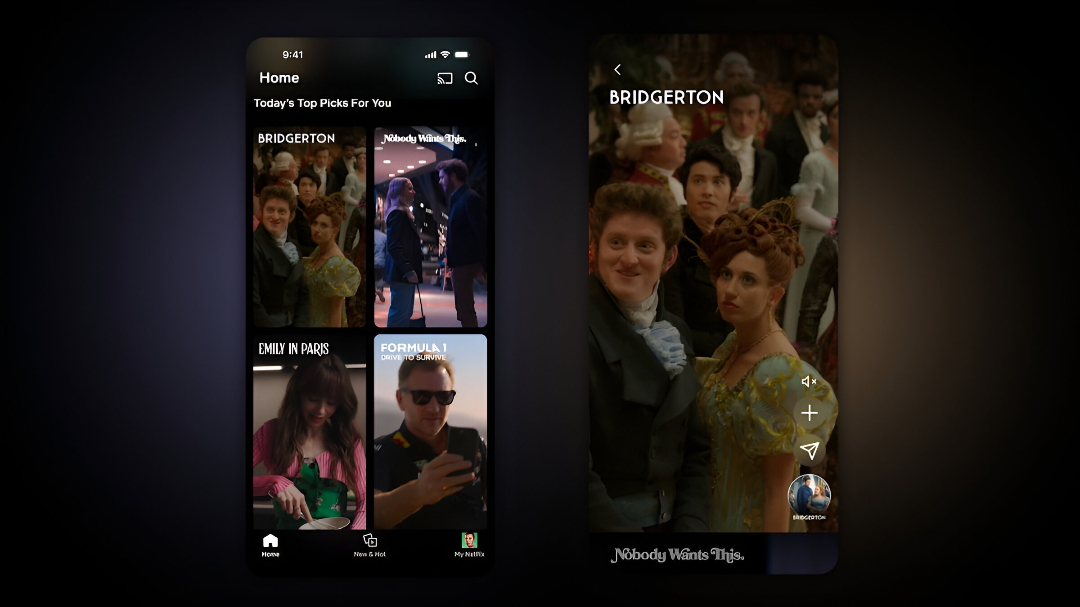
Netflix’s vertical feed of short clips represents the streaming equivalent of appetizers before the main course. It acknowledges a fundamental truth about 2025 viewing habits: sometimes viewers want bite-sized entertainment before committing to a two-hour movie.
The most revolutionary feature, however, is hiding in their iOS beta: an AI search that understands conversational requests. As described in Netflix’s announcement, the feature allows users to search using phrases like “I want something funny and upbeat.” Imagine mumbling “show me something with satisfying revenge that isn’t too dark” after a rough day, and having an algorithm actually understand the assignment. It’s like having Tony Stark’s JARVIS, but exclusively for entertainment recommendations.
The Real Streaming Wars Battlefield
While competitors struggle with basic functionality (looking at you, HBO Max crash screen), Netflix is leveraging user experience as its superpower. It’s playing chess while others are still figuring out checkers.
User experience experts widely acknowledge that major interface changes often meet initial resistance as users adjust to new layouts. However, Netflix’s Chief Product Officer Eunice Kim notes that “The new Netflix TV experience is still the one you know and love — just better,” suggesting the company has focused on maintaining familiarity while improving usability.
As these changes roll out globally, one thing becomes clear: in the battle for subscriber loyalty, content might be king, but user experience is the kingdom where that content lives. And Netflix just built a much nicer castle.


