



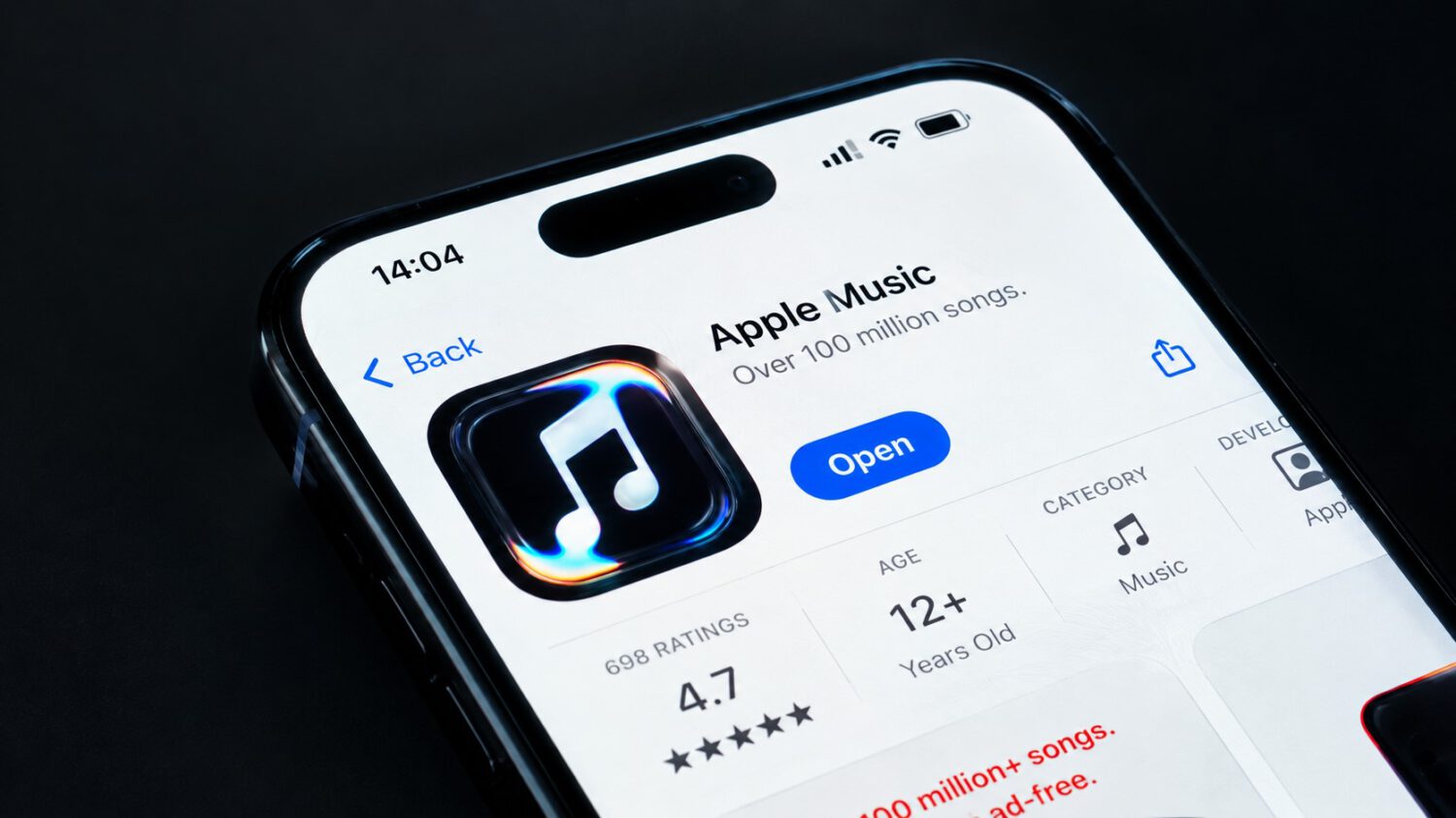
Sound is Apple Music’s core product. On October 21, 2026, Apple made it the raw material for the service’s visual identity as well, unveiling a redesigned logo, app icon, wordmark, and sonic identity built around a single premise: let sound physically reshape the brand. The project aligns with Apple’s broader Liquid Glass design direction, the material-focused visual language running through its current ecosystem.
Sound Moves Liquid. Liquid Becomes the Logo.
The production method explains everything the new identity looks like.
Apple’s team used a transducer to convert audio signals into physical vibrations, then transmitted those vibrations into mineral oil held in a shallow glass setup. The oil rippled and distorted in direct response to the music. The Apple Music logo was inscribed on the glass base beneath that liquid layer, and the sound-driven movement altered its appearance in real time as cameras captured the result.
Apple says the core effect was captured in camera using sound-driven liquid movement. British producer Fred again.. and the studio NEST Acoustics created the original composition that drove the process, according to The Verge. The resulting footage became the foundation for the entire new visual language.
What Changed Across the Brand
The rebrand covers every surface where Apple Music presents itself to listeners.
- New logo and app icon
- Updated wordmark using a modified, heavier lowercase treatment of Apple’s SF Pro typeface, retaining the Apple symbol
- New sonic identity created with Fred again.. and NEST Acoustics
- Redesigned content intros and event presentation
- Rollout tied to iOS 27.2 and macOS 27.2
The Case For and Against a Visual-Only Rebrand
The concept is coherent, but the rebrand does not change what happens after you press play.
The strongest argument for why this matters sits in the concept itself. Apple Music’s core product is sound, and the new identity uses sound as its literal raw material rather than as decoration. That creates a coherent logic between what the service sells and how it represents itself visually. Most streaming rebrands never bother to achieve that alignment.
The collaboration with Fred again.., whose recent production work has drawn wide critical attention, connects the brand to music-making culture rather than treating the sound logo as a separate marketing exercise. That distinction carries weight when competing for attention against Spotify’s algorithmic personalization and YouTube Music’s catalog reach, though characterizing the competitive landscape that way reflects analysis rather than independently verified data.
The counter-argument is equally straightforward. The announcement described here does not introduce a new subscription tier or a new listening feature. For subscribers who wanted improvements to the actual service, this is surface work, however well-executed.
When You’ll Actually See It
The new identity rolls out across software updates, original content, and live events.
The new identity begins appearing across Apple Music experiences with iOS 27.2 and macOS 27.2, according to MacRumors. Beyond the app icon on your home screen, expect it in original video content and live event presentation. Apple Music’s official account on X described the project as “a new identity for Apple Music, physically shaped by an original composition from Fred again.. and NEST Acoustics.” Apple also released behind-the-scenes footage on YouTube showing the liquid setup in action.
In a streaming market where services compete fiercely for the same listeners, a distinctive audiovisual identity is a tangible asset. Whether it translates into subscriber growth is a question the sound waves cannot answer.