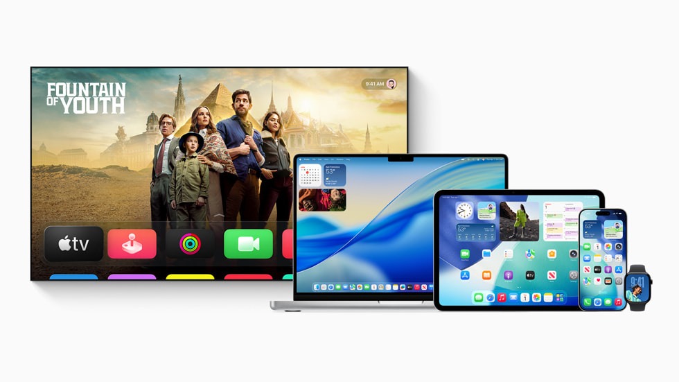
iOS 26’s Liquid Glass interface slathers translucency across every surface—icons bubble like soap, menus shimmer like mirages, and notifications float in glassy layers that make reading feel like squinting through a fishbowl. User complaints flood Reddit and Apple’s support forums, with reports ranging from headaches and eye strain to plain frustrating at interfaces that prioritize shimmer over substance.
The performance hit stings worse on older devices. That iPhone 12 you thought had years left now stutters through basic animations like a Windows Vista machine trying to run Crysis. Battery life takes a nosedive as your processor works overtime rendering effects that make every swipe feel like swimming through digital honey.
From Minimalism to Fisher-Price
Apple’s design philosophy just took a hard left toward the playful—whether you wanted it or not.
Remember when Apple meant clean, professional minimalism? Those days feel distant now that your productivity apps sport icons that wouldn’t look out of place in a Fisher-Price catalog. The “bubble-style” redesign trades Apple’s signature restraint for what critics call a “cartoony” aesthetic that makes serious work feel frivolous.
This isn’t Apple’s first controversial redesign rodeo. iOS 7’s flat design sparked similar outrage in 2013, with users mourning the death of skeuomorphism like a beloved pet. The difference? That transition eventually felt logical. Liquid Glass feels like change for change’s sake—Instagram’s latest UI experiment stretched across an entire operating system.
Escape Routes for Glass-Intolerant Users
Two buried settings can restore some sanity to your home screen.
Apple won’t let you roll back to iOS 25, but buried in accessibility settings lie two lifelines. Navigate to Settings → Accessibility → Display & Text Size, then toggle “Reduce Transparency” to strip away most glass effects. Your menus return to solid backgrounds, and your eyes get a break from constant visual noise.
For a middle ground, try “Increase Contrast” instead. This keeps some translucency while hardening borders and flattening the most aggressive 3D effects. Enable both settings together, and you’ll approximate the old iOS experience—though you’ll sacrifice Apple’s grand vision in the process.
No Looking Back
Apple’s betting big that you’ll eventually love what you currently hate.
Don’t expect Apple to blink on this one. The company positions Liquid Glass as its “next decade” interface direction, treating current complaints as growing pains rather than design failures. History suggests they might be right—remember how iOS 7’s flat design eventually became the industry standard?
Still, this transition feels different. Where iOS 7 simplified complexity, Liquid Glass adds layers that serve aesthetics over function. Your patience with the learning curve will largely depend on whether you see your iPhone as a tool or interactive art. For now, those accessibility settings remain your best bet for keeping productivity above eye candy.