Some cameras promise the moon but deliver confusion wrapped in aluminum and glass. While impressive specs can grab headlines, the real test comes when you’re fumbling for a button mid-shoot or wrestling with controls that seem designed by committee. This dive into photographic missteps reveals how even cutting-edge tech can stumble over basic usability, turning what should be creative tools into exercises in patience.
12. Canon XC10
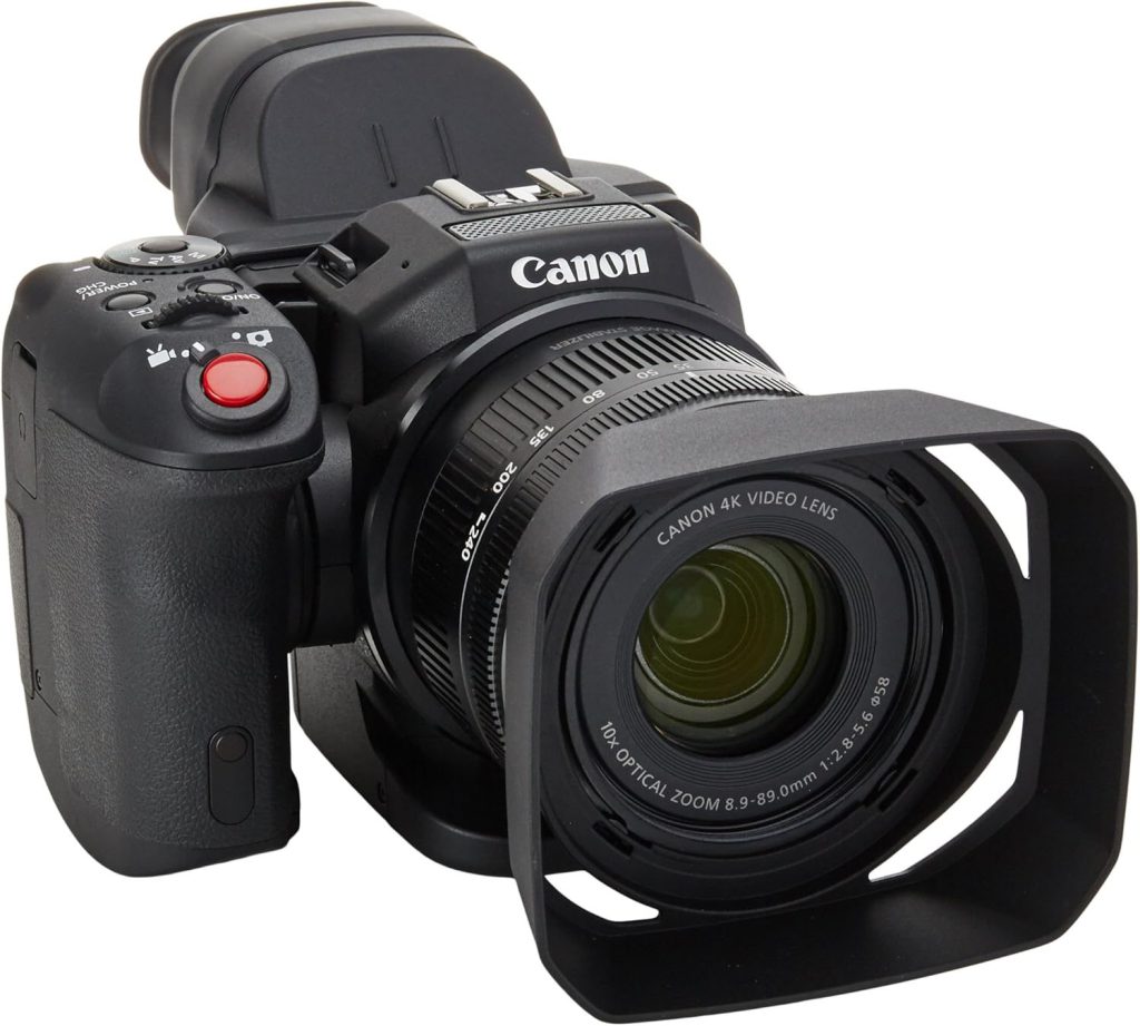
A hybrid camera that forgot how to be either.
Released in 2015, the Canon XC10 landed with such an ergonomic thud that it became a masterclass in what not to do when designing a hybrid camera. Its top-heavy build felt like trying to operate a brick balanced on a pencil, making handheld shooting a shaky nightmare. The variable aperture zoom crawled along at a glacial pace, making smooth video transitions as elusive as finding a parking spot at a unicorn convention.
Adding insult to injury, the touchscreen interface became useless once you attached the necessary loupe attachment (since there’s no built-in viewfinder). You were either squinting at a tiny screen with the loupe, or fumbling blindly with touch controls. It’s a design so fundamentally flawed, it makes you wonder if the engineers were conducting some elaborate practical joke.
11. Panasonic GF2
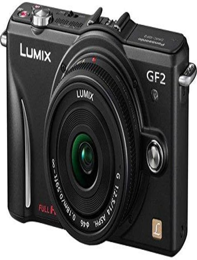
Simplification that complicated everything.
Panasonic ditched the physical mode and command dials that made the GF1 a hit, opting instead for a slick, touchscreen-only interface. They even offered it in a rainbow of fun colors, making it feel less like a serious camera and more like a toy you’d find at a department store electronics aisle.
The shift to the slower 14-42mm f/3.5-5.6 kit lens, paired with a 14mm f/2.5 pancake option, instantly killed the dreamy ‘big camera look’ people loved from its predecessor. This design philosophy, prioritizing surface-level appeal over functional depth, stalled Panasonic’s mirrorless momentum, proving that sometimes less is definitely not more when it comes to user control.
10. Sony RX100 Series
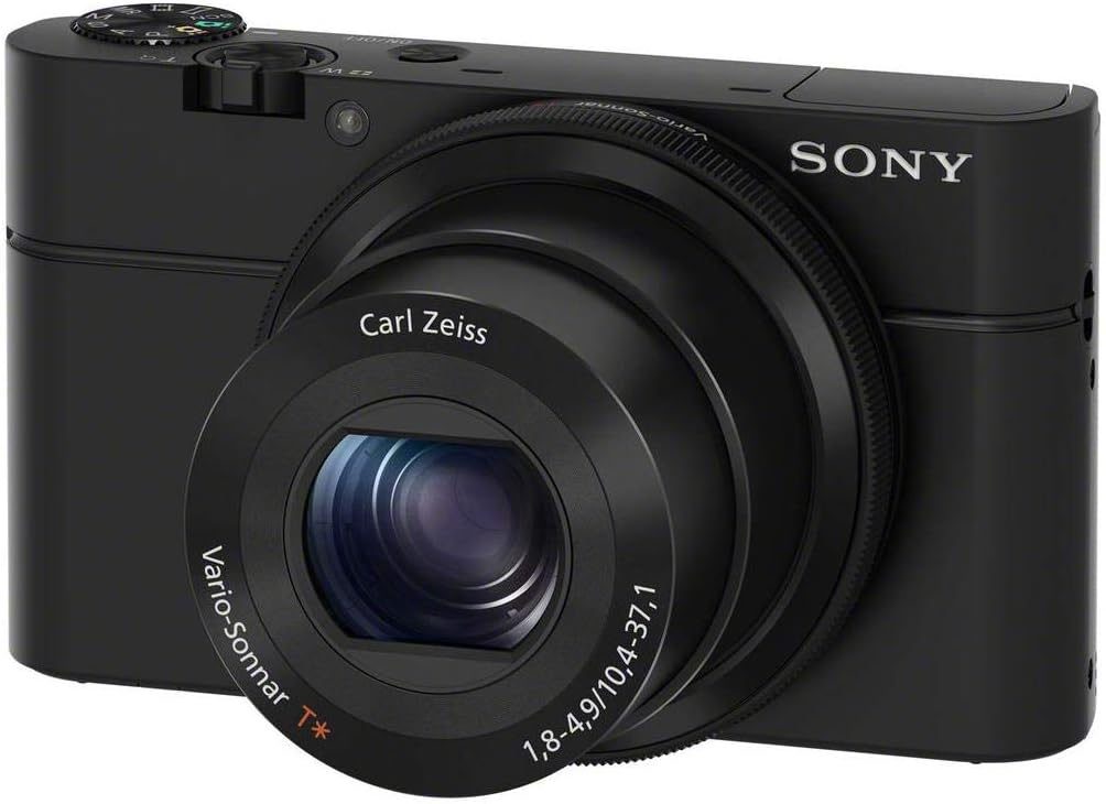
Pocket brilliance trapped by terrible controls.
Despite packing impressive imaging tech into a body smaller than a deck of cards, the RX100’s manual controls feel like afterthoughts. The tiny back dial and clickless front control dial make precision adjustments a digital thumb-wrestling match, especially compared to cameras where you can actually feel what you’re doing.
Sony’s stuck with this ergonomic headache across seven generations, from the original 2012 model through the VII in 2019. It’s like trying to conduct a symphony with oven mitts on. Competitors figured out better ergonomics years ago, proving that even a pocketable powerhouse with 1-inch sensors and versatile zoom lenses can be tripped up by something as basic as a decent dial.
9. Sony FS100/FS700
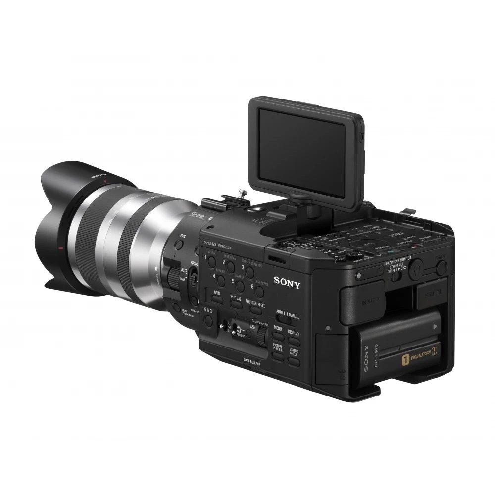
Pro cameras that needed babying.
The FS100 and FS700, released in 2011 and 2012 respectively, packed Super 35mm sensors but operated like delicate flowers. The LCD screen living on top meant you were constantly shooting from below eye level, and the loupe attachment felt as durable as a dry leaf in a hurricane—detaching more often than a TikTok trend.
That internal ND filter proved especially fragile. Anyone who’s dealt with delicate camera gear knows the panic of hearing that ominous click during a rushed filter swap. These cameras could jam their entire system during quick changes, leading to repairs that probably cost more than your monthly rent. Decent image quality, sure, but you had to baby them like Fabergé eggs.
8. Olympus OM-D E-M1X
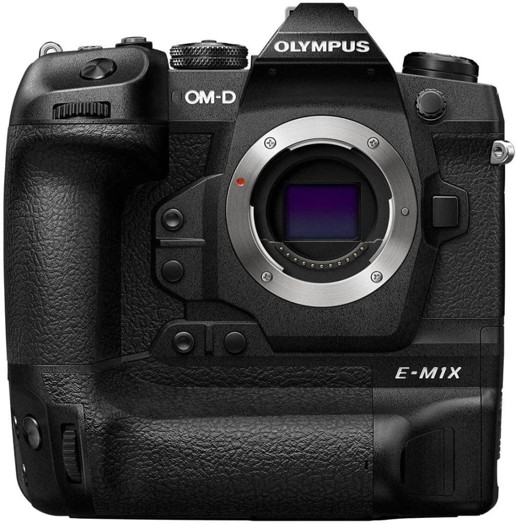
A linebacker at a ballet recital.
Released in January 2019, the E-M1X arrived with a massive, integrated vertical grip that contradicted the Micro Four Thirds system’s entire purpose of compact gear. While it boasted impressive 5.5-stop IBIS and AI-powered subject detection, that minuscule micro HDMI port seemed like a design afterthought—a postage stamp on a billboard.
This flagship camera never received a successor, leaving photographers who invested in its robust, wildlife-ready build wondering if they’d backed a racehorse that suddenly decided to nap. For all its ruggedness and excellent field handling, the E-M1X’s sheer bulk landed it squarely in the “what were they thinking?” category.
7. Sigma DP Quattro Series
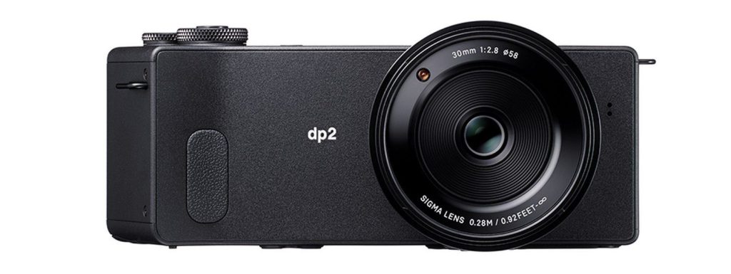
Angular art pieces that punished your grip.
Released in 2014, holding these cameras felt like gripping a sea urchin—uncomfortable and undeniably strange. The angular, trapezoidal grip forced an unnatural shooting stance, while the unnecessarily long body created an unbalanced form factor that made capturing the 29MP Foveon sensor’s incredible detail a real challenge.
The fixed-lens compacts (19mm, 30mm, and 50mm equivalent options) suffered from notoriously slow, battery-hungry processing that turned innovative sensor tech into a usability headache. Poor timing against increasingly capable full-frame rivals made their high-resolution potential difficult to access—like trying to paint a masterpiece with a paintbrush made of Lego bricks.
6. Pentax K-01
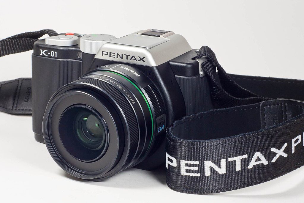
Designer vision meets practical disaster.
Designed by Marc Newson and launched in February 2012, this mirrorless camera showcased a form so baffling it practically dared you to hold it. The chunky body was essentially a hollow shell with empty mirror space, giving it the heft of a brick with the grace of a dropped anvil.
Paired often with its 40mm f/2.8 pancake lens (60mm equivalent), the camera offered no viewfinder options—just a fixed rear LCD. Trying to reseat its rubber port covers felt like wrestling a stubborn octopus, and the glued-on grips offered about as much comfort as sitting on a Lego. It’s a prime example of form dramatically losing the race to function.
5. Fujifilm X-Pro3
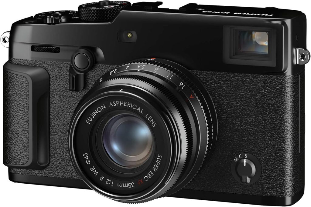
Radical design that challenged expectations.
Fujifilm’s October 2019 X-Pro3 ditched the obvious rear LCD for a hidden screen that only revealed itself when flipped down—a move designed to make you shoot from the hip like it’s 1985. While the hybrid viewfinder and film simulations were classics, the titanium build came with a fatal flaw.
The USB-C port proved as fragile as a reality TV romance, with many users reporting breaks long before hitting serious mileage. For a camera that demanded a specific kind of user—one who loved its art-house aesthetic—these durability headaches made the radical design about as practical as wearing a fur coat in July.
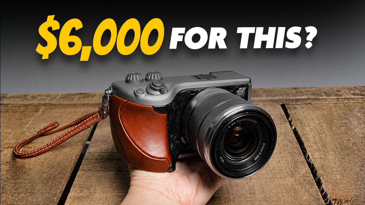
4. Hasselblad Lunar
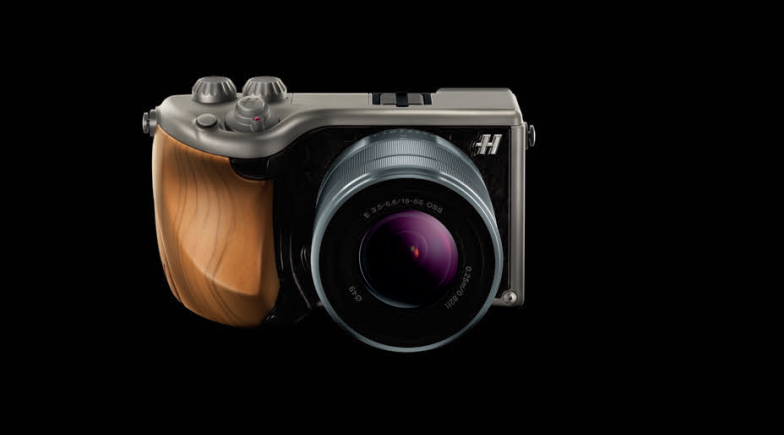
Luxury materials can’t polish poor design.
The Hasselblad Lunar, essentially a rebranded Sony NEX-7 with a 16MP APS-C sensor, decided to go full peacock instead of focusing on ergonomics. It sported grips made from wood or crocodile skin, sometimes draped in gold, with conical control dials that looked more like candy dispensers than professional tools.
With a price tag zooming past $6,000 and a garnet gem thrown in for good measure, this camera prioritized flashy ostentation over actual usability. This egregious misstep reportedly led to management shake-ups at Hasselblad, proving that throwing bling at a product doesn’t make it better—it just makes it tacky.
3. Leica CL
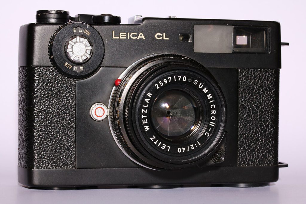
Pretty exterior hiding frustrating controls.
Announced in November 2017, the APS-C L-mount CL aimed for compact rangefinder style but stumbled on handling. Its dual rear thumb dials, each with integrated buttons, required using the same thumb for both functions, slowing down every adjustment.
The touchscreen created additional headaches—accidental touches when bringing the camera to your eye, plus long-press and swipe controls that felt more like suggestions the camera politely ignored. Despite its sleek looks, the CL proved that beautiful design means nothing if the shooting experience feels like an obstacle course.
2. Leica M (Typ 240)
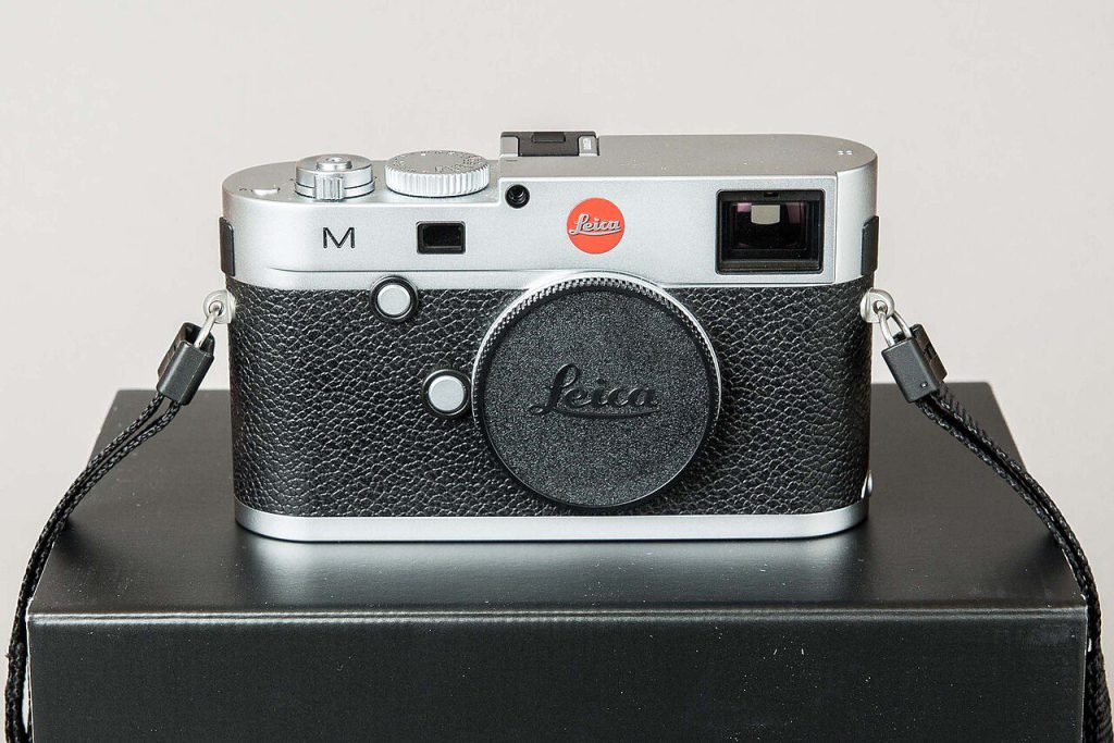
Digital features bloating a rangefinder legend.
When Leica embraced live view and 1080p video with the M (Typ 240) in September 2012, they put a brick in the pocket of a legend. This camera tipped the scales at a hefty 680g, far from the svelte M bodies photographers knew and loved.
Accessing the SD card involved removing the entire baseplate—a design choice about as convenient as needing a special screwdriver to swap phone batteries. Despite features like a sapphire LCD screen and weather sealing, the whole package felt like a compromise between rangefinder purity and digital convenience that satisfied neither camp.
1. Nikon Df
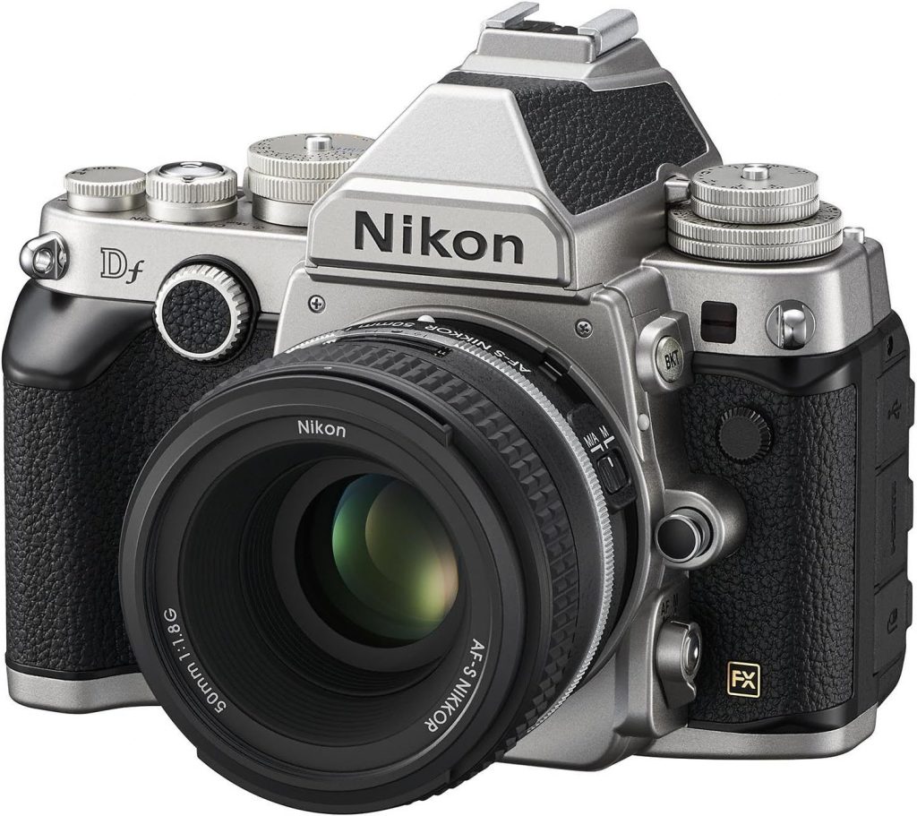
Retro styling hiding modern confusion.
Released in November 2013, the Df tried to bottle the magic of classic Nikon FM/FE cameras into a full-frame DSLR. From a distance, it looked vintage cool, but closer inspection revealed a plastic DSLR wearing a retro costume with a bizarre control layout.
The minuscule PASM dial and tiny LCD screen crowded the right side, while massive ISO and exposure compensation dials sat lonely on the left. This flagship 16.2MP sensor from the professional D4 lived in a consumer-grade body where vintage-style dials could be overridden by digital controls—creating situations where what the dial showed and what the camera did were completely different things.